All the components you need to create a delightful React webapp
Welcome UI is a customizable design system library made with react, typescript, tailwindcss, ariakit and a lot of love 💛
Let’s started!50+Amazing
components
components
650+Github
stars
stars
1K+Weekly
Downloads
Downloads
Some of our components
More than 50 amazing components!

All you’d expect from a design system...
...and a lot more!
Design
Carefully constructed by our Welcome to the Jungle designers, ensuring perfect consistency in your app design!
Documentation
Complete documentation with live code editors to help easily you implement our design system.
Productivity gain
A time-saver UI framework, designed to increase your productivity and your development experience.
Customizable
Allows you to use default themes as well as your own fully personalized ones, for made-to-measure components.
Accessibility
We are trying to offer an accessible experience as much as we can, using Ariakit for instance.
Typing
Migrated to Typescript, WUI offers you the safety of a strongly typed library.
Support
A developer team engaged in helping you, maintaining, as well as always improving its design system.
Mobile first
Make sure to offer an optimized mobile experience to your users thanks to our mobile oriented vision.
Going straight to the point!
Leave the UI code to our team and focus on building your astonishing project.
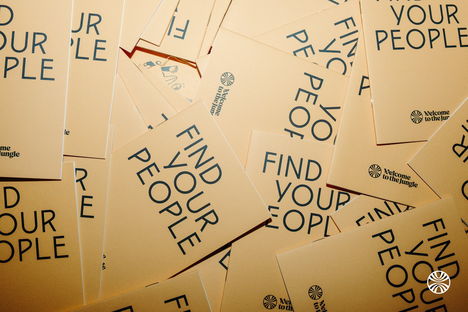
FIND YOUR PEOPLE
+90,000 opportunities to find the job that’s made for you.
We guide candidates to their future teams through immersive job listings and support them throughout their job search with a personalized candidate experience.