Welcome UI logo
FOUNDATIONSCOMPONENTSBLOG650+
10.1.0

Menu

    Actions

    • Button
    • ButtonGroup
    • Close Button
    • Link

    Data display

    • Accordion
    • Avatar
    • Badge
    • Card
    • Swiper
    • Table
    • Tag
    • VisuallyHidden

    Feedback

    • Alert
    • StickyNote

      NEW

    • Toast

    Forms

    • Checkbox
    • DatePicker
    • DateTimePicker
    • Field
    • FileDrop
    • FileUpload
    • Hint
    • InputText
    • Label
    • PasswordInput
    • Radio
    • RadioGroup
    • RadioTab
    • Search
    • Select
    • Slider
    • Textarea
    • TimePicker
    • Toggle

    Icons & logo

    • Icon
    • Logo
    • Stamp

      NEW

    • VariantIcon
    • WelcomeLoader

    Layout

    • AspectRatio
    • Loader
    • Window

      NEW

    Navigation

    • Breadcrumb
    • DropdownMenu
    • Pagination
    • Stepper

      NEW

    • Tabs

    Overlay

    • Drawer
    • Modal
    • Popover
    • Tooltip

    Typography

    • Text

    Utilities

    • Grid background

Overview

Props

Accordion

The Accordion component is a list of expandable items that allow users to reveal or hide content by clicking on headers. It helps keep interfaces clean and organized by displaying information in collapsible sections.

SourceBuilt with Ariakit
Github
import { Accordion, useAccordion } from 'welcome-ui/Accordion'
const Example = () => {
const accordion = useAccordion()
return (
<Accordion store={accordion}>
<Accordion.Disclosure>
<Accordion.Header title="Accordion title" />
</Accordion.Disclosure>
<Accordion.Content>
Lorem ipsum dolor sit amet, consectetur adipiscing elit, sed do eiusmod tempor incididunt ut
labore et dolore magna aliqua. Ut enim ad minim veniam, quis nostrud exercitation ullamco
laboris nisi ut aliquip ex ea commodo consequat.
</Accordion.Content>
</Accordion>
)
}
export default Example

Examples

Composition

Compose your own accordion with the provided components (Action, Icon, Tags) or use your own:

Github

Tags

Use the Tags component to display tags in the accordion header.

Github

Wrapper components

The Accordion sub-components serve different usage, but they come with restriction. For example, to use the accordion with composed actions, or with tags, you'll have to use the right wrappers because they work together to create the accordion's responsive behaviors.

How to use them

In it's most simple form, the accordion's layout looks like this:

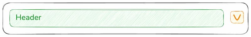
If you want to compose actions, icons, or your own components, you have to use the Accordion.HeaderWrapper component. It will ensure that the accordion's responsive behaviors work as expected, and that the layout is consistent across all use cases.

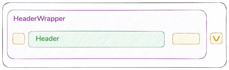
Here's ow it behaves on a small screen:

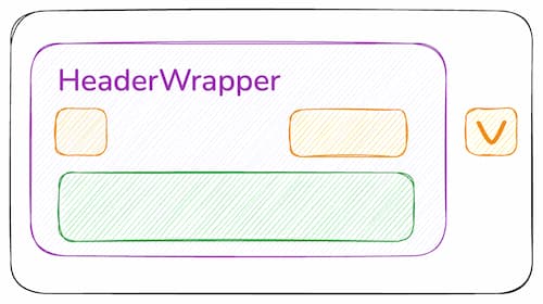
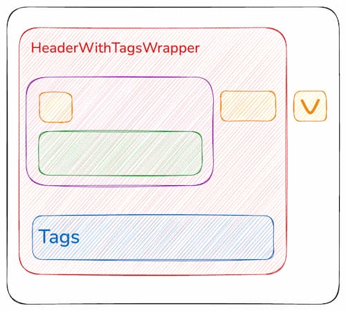
For the tags, we use two additional wrappers: Accordion.HeaderWithTagsWrapper and Accordion.HeaderWithTags. They serve the same purpose as before, but they also ensure that the tags are wrapped correctly while the right actions stays aligned with the arrow button.

Size

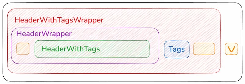
Size prop will propagate to the accordion components: actions, icons, title, etc.

Github

Size propagation with composition:

Github

Open at start

Add defaultOpen options to useAccordion to open the accordion at the start.

Github

useAccordion

We use useDisclosureStore from Ariakit Disclosure for the state of the accordion, with the animated flag set to true by default.

Pass options to useAccordion:

  • defaultOpen: const accordion = useAccordion({ defaultOpen: true })

The hook returns (among other things):

  • useState('open'): whether the accordion is currently open
  • hide: a function to hide the accordion
LinkAvatar

On this page

  • Definition
  • Examples
    • Composition
    • Tags
    • Wrapper components
    • Size
    • Open at start
  • useAccordion
Made with by
Welcome to the jungle logo

Documentations

  • Foundations
  • Components
  • Source code

Updates

  • Releases
  • Issues

Community

  • Github
  • Twitter
  • Medium
  • Jobs